Posts
GitHub
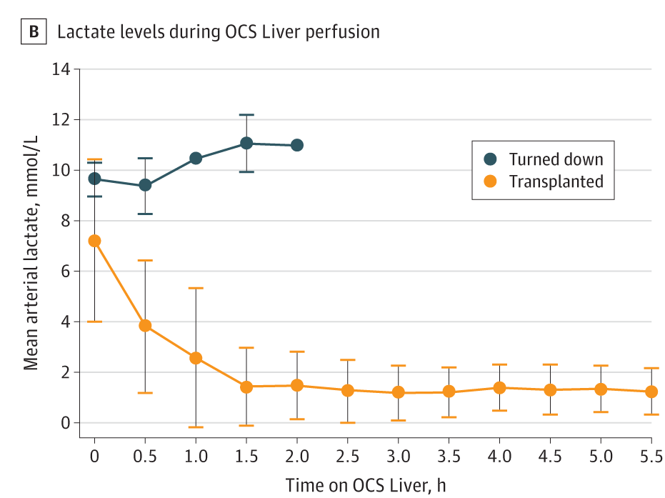
First week’s figure is from an RCT published in JAMA Surgery. Codes for the replica of Figure-1B will be here.
Selected article:
Title: Impact of Portable Normothermic Blood-Based Machine Perfusion on Outcomes of Liver Transplant
The OCS Liver PROTECT Randomized Clinical Trial
Journal: JAMA Surgery
Authors: Markmann JF, Abouljoud MS, Ghobrial RM, et al.
Year: 2022
PMID: 34985503
DOI: 10.1001/jamasurg.2021.6781
the original figure:
Import libraries
library(tidyverse)
library(scales)
library(fabricatr)      # to fabricate fake data
library(ggsci)          # for using JAMA color pallette (not needed here)

theme_set(theme_light(base_family = "Open Sans")) # Updated on 2022-01-24 ("Helvetica Neue" was converted to "Open Sans")
Prepare fabricated data
# prepare a dataset for group 1:
set.seed(2022)
OCS_liver <- fabricate(
  N = 152,
  group = "OCS_liver",
  time_0 = round(rnorm(N, mean = 7.4, sd = 2.9),2),
  time_0.5 = round(rnorm(N, mean = 3.8, sd = 2.2),2),
  time_1.0 = round(rnorm(N, mean = 2.6, sd = 2.8),2),
  time_1.5 = round(rnorm(N, mean = 1.4, sd = 1.45),2),
  time_2.0 = round(rnorm(N, mean = 1.5, sd = 1.2),2),
  time_2.5 = round(rnorm(N, mean = 1.3, sd = 1.3),2),
  time_3.0 = round(rnorm(N, mean = 1.2, sd = 1.0),2),
  time_3.5 = round(rnorm(N, mean = 1.3, sd = 0.9),2),
  time_4.0 = round(rnorm(N, mean = 1.5, sd = 0.7),2),
  time_4.5 = round(rnorm(N, mean = 1.4, sd = 1.0),2),
  time_5.0 = round(rnorm(N, mean = 1.5, sd = 0.8),2),
  time_5.5 = round(rnorm(N, mean = 1.4, sd = 1.0),2)) %>%
  as_tibble()


# prepare a dataset for group 2:
set.seed(2022)
ICS <- fabricate( # because the n is too small, I preferred manual values for some.
  N = 3,
  group = "ICS",
  time_0 = c(9.2, 9.8, 10.4),
  time_0.5 = c(8.8, 9.4, 10.4),
  time_1.0 = round(rnorm(N, mean = 10.5, sd = 0),2),
  time_1.5 = c(10, 11.1, 12.2),
  time_2.0 = round(rnorm(N, mean = 11, sd = 0),2)) %>%
  as_tibble()


# Combine two dataset
combined_dataset <-  bind_rows(OCS_liver, ICS) %>%
  mutate (patient_id = paste0("P_", row_number())) %>%
  select(patient_id, everything(), -ID)
Convert possible original dataset to TIDY data
tidy_data <- combined_dataset %>%
  pivot_longer(starts_with("time"),
               names_to = "time",
               values_to = "values") %>%
  filter(!is.na(values)) %>%
  # mutate(values = if_else(values<=0, 0, values)) %>% # this is a possible mistake in the article figure. SD should not go below 0.
  group_by(group, time) %>%
  summarise(mean= mean(values, na.rm = TRUE),
            sd= sd(values, na.rm = TRUE))  %>%
  ungroup() %>%
  separate(time, into = c("blank", "time"), sep = "_") %>%
  mutate(time = factor(time))
R codes for the figure
w1_replica <- tidy_data %>%
  ggplot(aes(time, mean, color = group)) +
  geom_errorbar(data = . %>% filter(sd != 0), # single errorbar was ok, but colors of edges and lines are different. Therefore, I used an additional geom_linerange
                aes(ymin = mean - sd, ymax = mean + sd), width = .3, size = .3, show.legend = F) +
  geom_linerange(aes(ymin = mean - sd, ymax = mean + sd), color = "black", size = .3) +
  geom_point(size = 3) +
  geom_line(aes(group = group), size = .6, show.legend = F) +
  # scale_color_jama(labels =c("ICS" = "Turned down","OCS_liver" = "Transplanted")) + # JAMA has its own color palette, but I preferred using manual values.
  scale_color_manual(values = c( "ICS" = "#244551","OCS_liver" = "#F28118"), labels =c("ICS" = "Turned down","OCS_liver" = "Transplanted")) +
  scale_y_continuous(breaks = seq(0,14,2), labels = number_format(accuracy = 1)) +
  labs(x = "Time on OCS Liver, h",
       y = "Mean arterial lactate, mmol/L",
       title = "Lactate levels during OCS Liver perfusion\n") +
  theme(panel.grid.major.x = element_blank(),
        panel.grid.minor.x = element_blank(),
        panel.grid.major.y = element_line(color = "lightgray", size = .3),
        panel.grid.minor.y = element_blank(),
        panel.border = element_blank(),
        axis.line = element_line(colour = "black"),
        axis.ticks.length = unit(.20, "cm"),
        axis.ticks = element_line(color = "black", size = .5),
        axis.text = element_text(color = "black", size = 10),
        axis.title.x = element_text(size = 10, vjust = -1),
        axis.title.y = element_text(size = 10, vjust = 1),
        legend.title = element_blank(),
        legend.background = element_rect(colour = "black", size = .2),
        legend.position = c(.80, .75),
        legend.text = element_text(size = 9),
        legend.text.align = .5,
        legend.spacing.y = unit(0, "cm"),
        legend.spacing.x = unit(0, "cm"),
        legend.key.height = unit(.4, "cm"),
        plot.margin = unit(c(1,1,1,1), "cm"),
        plot.title = element_text(hjust = -0.1, vjust = 2)) +
  guides(colour = guide_legend(override.aes = list(shape = 16, size = 3))) +
  coord_cartesian(xlim = c(0.5, n_distinct(tidy_data$time)), ylim = c(-0.5, 14), expand = 0, clip = "off")  # using n_distinct is better than 12 for reproducibility.

ggsave(w1_replica,
       # filename = "content/blog/2022-01-18-week-1/w1_replica.jpg",
       filename = "w1_replica.jpg",
       dpi = 300,
       width = 5,
       height = 4)
Final replica
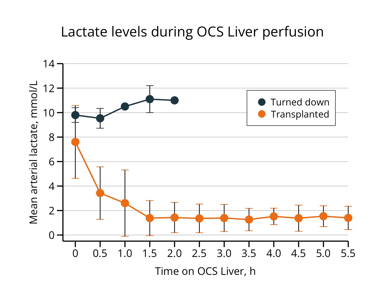
Some personal recommendations:
Major:
- I would not prefer using negative SD (lower threshold of 1sd of mean) values.
- There is an overlap in the errorbars on time-0. I would prefer using position_dodge.
- visualizing a distribution for a small-sized group (n = 3) may not be a good idea.
Minor:
- I would not prefer using 1.0, 2.0, 3.0, etc. 1, 2, 3, is ok.
Notes:
- The management of tags is ok with patchwork package, and should be done at the end.
- I m not sure about the font. an update may be required. (updated to “Open Sans”)
- figure ratio in the blog is slightly different than the rstudio version.
Citation
Ali Guner (Jan 18, 2022) Week-1. Retrieved from https://datavizmed.com/blog/2022-01-18-week-1/
@misc{ 2022-week-1,
author = { Ali Guner },
title = { Week-1 },
url = { https://datavizmed.com/blog/2022-01-18-week-1/ },
year = { 2022 }
updated = { Jan 18, 2022 }
}